When you look at Apple’s website and then compare it to yours, the difference is crystal clear. Apple’s design is sleek, intuitive, and purpose-driven, while most websites, maybe even yours, often miss these essential elements. To bridge that gap, we’re going to break down exactly what they do right—and how you can apply the same principles to make your website look premium.

So, if you want a website that’s clean, high-converting, and effortlessly guides users toward action, tag along and read on to implement these strategies on your own website.
What Apple Gets Right in UI/UX
1. Minimal Yet Functional Header
Apple’s top navigation is simple, clean, and strategically placed. The logo sits on the top left, while product categories are aligned in order of priority—Macs, iPads, iPhones, etc. This isn’t random; it’s based on what sells best.
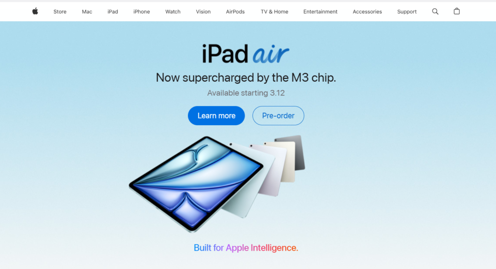
2. A Homepage That Puts Products First
Apple’s homepage doesn’t waste time—it’s product-focused, with large, visually striking images and clear call-to-action buttons (“Buy” or “Learn More”). The typography is big and readable, ensuring clarity.
3. Smart Use of Real Estate
The main product (like the iPad air) gets a dedicated hero section with high-quality images and a bold yet simple message. This section takes up a lot of space, making sure it’s the first thing users notice.
4. Engaging Animations That Enhance UX
Scrolling down, Apple incorporates interactive animations that make the user experience feel premium. For example, the iPad Air page has smooth, responsive animations that make exploring the product more engaging.
5. Seamless Navigation & Logical Structure
Apple divides products into logical sections, making navigation effortless. Even the layout shifts—switching from black to white backgrounds—create a dynamic visual effect that keeps users engaged.
6. Focused, Non-Overwhelming Content
Apple avoids clutter. Product pages have a simple headline, a short subheadline, and a visually striking image. No unnecessary paragraphs—just what’s essential for a purchase decision.
7. Strategic Page Length & Flow
Their pages are long but not boring. Instead of dumping specs in a dull list, Apple integrates visuals and storytelling, keeping users scrolling without feeling overwhelmed.
If there’s one thing great brands get right, it’s design. A strong visual identity isn’t just about aesthetics—it’s about communication, emotion, and trust. Whether it’s a sleek website, a bold social media presence, or eye-catching marketing materials, every element should work together to tell a story.
Design Rules You Need to Follow
1. Just Enough Flair
Less is more. If you want your website to look elegant and expensive you need to take some of the items away. Then only you can make your website look premium.
2. Timelessness
Avoid trends. Design fads come and go, and following them can make your website look outdated quickly. For example, a few years ago, many websites used a childlike, casual feel with blobs of color scattered throughout. Melissa Griffin’s website, which hasn’t been updated in years, still reflects this past trend. Jenna Kutcher also had a similar branding style during the same period, incorporating colorful, stylized paintbrush strokes.
Instead of chasing trends, stick to timeless design principles. This also applies to color choices. Neutral tones and colors found in nature—especially those seen in summer and fall—tend to look more expensive. Some shades of blue or red may appear luxurious, while others might not. Choose subtle, natural shades for a refined look.
3. Intentional Imagery
High-end websites don’t rely on images taken in expensive-looking locations. Instead, they focus on artistic composition. Compare two sets of business-related photos: One set looks high-end because the images seem naturally captured, with soft angles and an unposed feel. The other set appears staged, with bright colors and forced compositions, which can make a site look less sophisticated.
Even in personal branding, this makes a difference. Looking at older brand photos, the posed, straight-on shots appear less refined compared to newer ones where the subject is in motion, caught in natural moments. Movement, unconventional cropping, and candid shots help create a more elegant aesthetic.
4. A Liberal Use of Spacing
Luxury brands use space strategically. Walk into a high-end fashion store, and you’ll see only a few clothing items on the racks, each with space to breathe. Compare this to Walmart, where racks are packed tightly with products. The same applies to web design.
A Liberal Use of Spacing
Luxury brands use space strategically. Walk into a high-end fashion store, and you’ll see only a few clothing items on the racks, each with space to breathe. Compare this to Walmart, where racks are packed tightly with products. The same applies to web design.

Look at Chanel’s website: The content is centered with plenty of white space. Contrast this with Walmart’s site, where every inch is filled with content, leaving no room to focus on individual elements. More space equals a more luxurious feel.
5. Direct Statements
If you want your website to look expensive, don’t actually use the word luxury or high-end or premium or expensive in the copy. Subtlety is key both in your language on the site and any other aspect of the website.
6. One Element of Creativity
You can break the rules—but only one at a time.
For example, Tiffany & Co. uses a bold, non-natural blue as its signature color. However, everything else—fonts, spacing, and imagery—follows timeless design rules. If you break too many rules at once, you lose the refined, high-end look.
Applying these principles will help your website look more elegant and expensive without relying on fleeting trends. Now, go apply these strategies and watch your website transform.
Here’s how Viral Omega can contribute to your brand and help you make your website look premium.
What We Do
- Branding – More than just a logo. We create a full visual identity with colors, typography, and design elements that tell your brand’s story and leave a lasting impression.
- Social Media Post Design – Stop the scroll. Our designs make people pause, engage, and remember your brand in a crowded digital space.
- Flyer & Poster Design – Whether it’s an event, product launch, or promotion, we design flyers and posters that turn heads and drive action.
Why Work With Us?
Your brand’s first impression matters. We don’t do cookie-cutter designs—everything is custom, built to match your vision and make an impact. Let’s create something that truly represents your brand.
Use elegant typography, spacious layouts, and high-quality visuals. Stick to a refined color palette, maintain consistency, and avoid design fads that can make your site look outdated.
A premium website prioritizes a clean, structured layout with a strong visual identity. It avoids clutter, maintains brand consistency, and uses high-quality imagery with clear typography.
Luxury brands use strategic whitespace. Just as high-end stores space out products, websites like Chanel’s use centered content with plenty of room to create a refined aesthetic.