
Do you know that 93% of the consumers consider visual appearance to be a key deciding factor in the purchasing decision? Consider the fact that the first thing you notice about a brand is its logo, color, or pattern. More than this, these visual elements have a hidden potential to tap into human psychology, evoke emotions, and build loyalty to a brand.
In this article, Viral Omega will expose the secrets of brand patterns, colors, and logo design.
Why Visual Identity Matters
Your logo, patterns, and brand patterns are like the face of your brand. They’re the first things people notice and form an impression on. Done right, they tell your story before a single word is spoken.
For instance:
- A bold, geometric logo can signal professionalism and strength.
- Playful, asymmetric patterns create a sense of excitement and youthfulness.
- Calm, pastel tones evoke serenity and sophistication.
Visuals directly influence how the consumer feels about your brand patterns. Get it right, and they’ll associate you with positive emotions—trust, fun, or reliability. Get it wrong, and your brand could seem forgettable or unappealing.
The Psychology Behind Brand Patterns
Patterns aren’t just decorative; they set the tone for the way your brand is being perceived.
- Asymmetric Patterns: Envision companies such as Spotify or Snapchat. Their irregular shapes paired with bright colors scream creativity, energy, and fun. These patterns are perfect for brands targeting younger, dynamic audiences.
- Nature-Inspired Patterns: Earthy brands often lean into organic shapes and textures—like flowing lines or leafy motifs—paired with greens and browns. These elements evoke feelings of authenticity and sustainability.
- Minimalistic Patterns: Luxury brands like Chanel or Gucci use sleek, repetitive designs with metallic accents or monochromatic tones. Minimalism communicates elegance and exclusivity.
Key Insight: Patterns can be tailored to your brand patterns‘s personality. Bright colors and playful shapes? Go for fun. Natural textures and muted tones? Go for earthy. Sleek lines and monochrome? Go for sophisticated.
Colors: The Heartbeat of Your Brand
Colors are a universal language—they evoke emotions and influence decisions faster than words ever could. Here’s how colors shape perceptions in logo and brand design:
- Blue: Trust, reliability, and calmness. No wonder tech giants like Facebook and LinkedIn use it.
- Green: Growth, health, and nature. Eco-conscious brands like Whole Foods thrive on green.
- Yellow: Optimism, energy, and happiness. McDonald’s uses yellow to draw in a younger audience.
- Purple: Luxury, creativity, and mystery. Think Cadbury or Hallmark.
- Orange: Friendliness and confidence. Brands like Fanta and Harley-Davidson make orange their own.
Pro Tip: Break the rules when needed. Combining unexpected colors—like Tiffany’s robin egg blue for luxury—can set your brand apart.
Geometry in Logo Design
Shapes play an equally powerful role in branding:
- Circles: Unity, inclusivity, and continuity. Look at the Olympics logo—it’s instantly recognizable and globally relevant.
- Squares and Rectangles: Stability and professionalism. Many corporate logos, like Microsoft‘s, rely on these shapes.
- Triangles: Dynamism and innovation. Brands like Adobe use triangles to appear forward-thinking.
- Organic Shapes: Artisanal, handmade vibes. These work well for eco-conscious or boutique brands.
Symbols, too, are potent. Take Toblerone’s mountain logo—look closely, and there’s a bear hidden within, symbolizing the Swiss town of Bern. Clever visuals like this make logos memorable.
Fonts: A Brand’s Voice in Writing
The right font speaks volumes about your brand’s personality:
- Serif Fonts: Traditional and trustworthy (think The New York Times).
- Sans-Serif Fonts: Modern and clean (hello, Google).
- Script Fonts: Elegant and creative (often used by luxury or artistic brands).
- Display Fonts: Bold and stylized for impact, like Coca-Cola.
Pro Tip: Choose a font that reflects your brand’s values. A law firm and a bakery shouldn’t share the same typography.
Cultural Sensitivity
Different cultures have different meanings for certain visuals. While white signifies purity in the West, it represents mourning in parts of Asia. Similarly, a thumbs-up symbol might be friendly in the US but offensive in other countries.
Examples of Cultural Sensitivity:
- Red is auspicious in China, but it means danger in Western countries.
- In the West, there’s no such thing as the lucky number 13, while in Asian cultures, the number 8 is revered.
TipDo research on cultural contexts when creating for global markets to avoid unintended missteps.
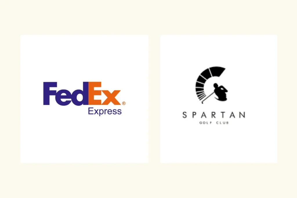
Negative Space: The Art of Simplicity
Negative space can turn a good logo into a great one. look at the FedEx logo with its hidden arrow or the Spartan Golf Club logo, where a golfer mid-swing doubles as a Spartan helmet. These clever designs engage the viewer and enhance recall.
How to Use Negative Space:
- Look for hidden symbols in the gaps.
- Use it to create balance and simplicity.
- Ensure it works across platforms, from billboards to app icons.
Lessons from Famous Logos
Some of the best logos tell a story in seconds:
- Toblerone: A mountain peak with a hidden bear, combining local heritage with the product shape.
- Amazon: The arrow from A to Z symbolizes the wide range of products and a smile, signifying customer satisfaction.
- London Symphony Orchestra: Its initials form a conductor in mid-motion, blending art and function.
Crafting Your Brand’s Visual Identity
Here’s how to start:
- Define Your Brand Personality: Are you playful, serious, or luxurious? Your visuals should reflect that.
- Choose Colors Wisely: Pick hues that resonate with your audience and align with your values.
- Play with Shapes and Symbols: Incorporate shapes that amplify your message.
- Simplify: A clean, versatile logo works across platforms and is easier to remember.
The images-patterns, colors, logos-of your brand are its silent ambassadors. Working for you 24/7 to tell the world who you are and what you stand for. It’s understanding design psychology and adjusting the way it approaches that creates the most deep resonance and can cut through all the noise in a very crowded marketplace.
Next time you look at a logo or pattern, remember it’s not just art—it’s science, storytelling, and strategy all in one.
Brand patterns enhance a brand’s identity by adding depth and consistency. They make your branding visually appealing, versatile, and instantly recognizable, helping to reinforce your brand across multiple platforms and touchpoints.
A logo is a visual mark or symbol that represents a company or brand. It can be a simple wordmark, a graphic symbol, or a combination of both. A logo is often the first thing customers notice and remember about a brand.
To choose a brand pattern, align it with your brand’s personality, audience, and message. Options include geometric, organic, abstract, or illustrative designs. Ensure it complements your logo and works across platforms to create a cohesive, memorable identity.