When a brand as iconic as Walmart updates its logo for the first time in nearly 20 years, people notice. And when those changes seem, well, subtle, the internet inevitably responds with its favorite tool: memes. From jokes about how little has changed to reimagining the famous “Spark” icon as everything from a fidget spinner to a sunburst emoji, Walmart’s new logo Redesign has taken the online world by storm.
Let’s break it down together.
What’s behind Walmart’s New Logo Redesign?
1. The Wordmark
The text now appears in a modern, slightly bolder font, so it is now cleaner and more readable on the digital side—subtle, yes, but very effective. This also pays homage to the heritage of Walmart, drawing inspiration from classic trucker hats designed by founder Sam Walton.
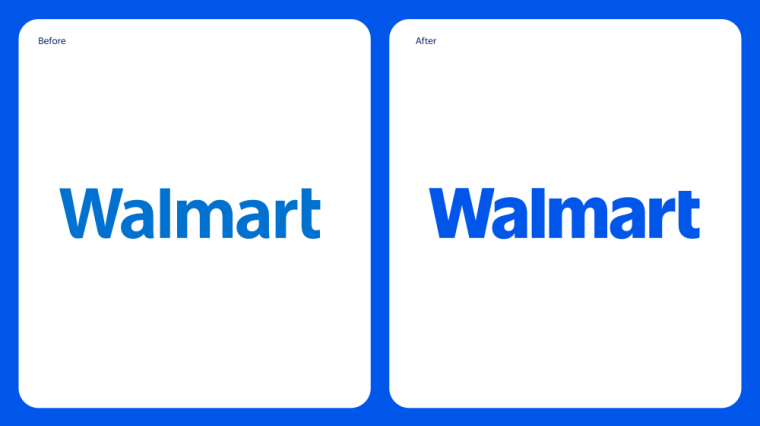
2. The Spark Icon
The six-pronged symbol we’ve come to associate with Walmart has been softened with rounded corners and a thicker design. The result? A smoother, more polished look that stands out better at smaller sizes—ideal for app icons, social media, and digital advertising.

3. The Color Palette
Walmart’s new logo redesign has gotten brighter, breathier, fresher, and livelier. They’ve added a wider range of supporting colors, offering much more fluidity in so many touchpoints of branding.
On paper, these changes may not seem revolutionary. But that’s exactly the point.
Subtlety is the Secret
Let’s face it: drastic rebrands can be risky. For every successful overhaul, like Instagram’s colorful gradient icon, there’s a Gap logo redesign disaster lurking in the shadows. Take Jaguar’s minimalist shift—sleek for some, lifeless for others. Walmart knows this balancing act well.
Their customers aren’t looking for flashy, over-the-top changes. They value familiarity, consistency, and trust. Walmart’s approach was to modernize without alienating its loyal base—a move that screams, “evolution, not revolution.”
Think about it: Would you even recognize Walmart’s new logo Redesign if they abandoned their blue-and-yellow color scheme? Or replaced the Spark with, say, a minimalist geometric shape? Probably not. Instead, they’ve taken what works and refined it for a digital-first world.
Memes spark “I can’t believe someone got paid for this.”
Of course, the internet had its own ideas.
When Walmart unveiled its new look, it didn’t take long for social media to light up with jokes. Some users joked, “Walmart just spent millions to round some corners,” while others reimagined the Spark as a fidget spinner or a sunburst emoji.
Then there were the comparisons to other brands. “Walmart is entering its LinkedIn era,” one user quipped, referring to the polished, professional vibe of the new design. Another joked, “Walmart’s new logo is Amazon Prime Lite.”
But here’s the kicker: All this meme-worthy attention may actually be a win for Walmart.
Marketing Lessons from Walmart’s new logo Redesign
Today memes are a double-edged sword. On one hand, they can poke fun at a brand. On the other, they can generate massive amounts of free publicity. Walmart’s redesign landed squarely in the second camp.
Here is why the memes work in favor of Walmart:
- Visibility: Whether people love it, hate it, or laugh at it, they’re talking about it. For a brand as massive as Walmart, staying top-of-mind is half the battle.
- Relatability: The jokes humanize Walmart. They make the brand feel approachable and part of the cultural conversation.
- Engagement: Every meme, tweet, and post keeps the logo—and Walmart—front and center.
It’s a classic case of “no publicity is bad publicity.” Walmart made sure their redesign was getting the right kind of attention that money can’t buy—staying at the top of trending topics.
The Real Genius of Walmart’s New Logo Redesign
Under all the memes and jokes lies a thought. Walmart’s redesign wasn’t only about looks; it was a preparation for the future.
Here’s how:
- Digital Optimization: In 2025, digital platforms are where brands live and breathe. The updated version of the font and the new Spark icon are meant to shine, no matter the screen size—from smartphone applications to social media posts.
- Color Psychology: Bright blue and an expanded palette have deeper, emotional undertones: they feel more trusted, more dependable, and more energetic—whole, consistent elements that have to be surmounted in a competitive retail space.
- Brand Flexibility: Keeping the changes subtle, Walmart maintains its identity but gives room for growth. The new design can adapt to new products, services, and technologies seamlessly.
A Story of Evolution
Let’s take a step back for a moment. Walmart’s redesign isn’t about rounding corners or thickening lines. It’s part of a bigger story—a story of evolution.
Throughout the years, Walmart has been changing from a simple discount store into a global superpower competing with Amazon through the virtual environment. This redesign speaks of that journey. It says, “We are fresh, we’re flexible, but we remain the Walmart you know and love.”
So, Was It Worth It?
The million-dollar question: Did Walmart’s redesign pay off?
Well, let’s look at the facts. They’ve sparked (pun intended again) a huge online conversation, modernized their branding for the digital age, and stayed true to their roots. Sure, some people will joke about the subtle changes, but in the long run, those small tweaks could make a big difference.
As David Hartman, Walmart’s Vice President of Creative Design, said, “It’s an evolution, not a revolution.“
What Can We Learn?
And what this Walmart remaster-cum-redesign says is that sometimes, less is more. In a world obsessed with flashy, attention-grabbing changes, there’s power in subtlety.
The next time you see that meme about Walmart Spark, remember: behind each softened corner, brightened blue, there lies a strategy. And judging by the buzz, it’s a good one.
What do you think of Walmart’s new look? Smart move or missed opportunity?
Walmart updated its logo as part of a brand refresh, showcasing its evolution and aligning with a modern, professional identity.
The “spark” symbolizes innovation and inspiration, using True Blue and Spark Yellow tones for a fresh and recognizable design.
Companies modernize logos to stay relevant, connect with new audiences, and align with evolving brand identities and digital trends.
Walmart is renowned for its low prices, extensive product range, and global presence as a retail giant.