Most brands miss the mark with their website graphics. It’s not enough for visuals to look impressive. At Viral Omega, we see this mistake almost every day. Brands drop in sharp images, polished icons, or fancy animations hoping to wow visitors but without any real purpose behind them, those visuals do absolutely nothing for the user experience.
And here’s the thing no one wants to admit: A good website graphics isn’t decoration. It’s a tool.
It should guide attention, spark a feeling, and reinforce your message. If it’s not doing that, it’s just clutter. Brands that figure this out see higher engagement, stronger recognition, and better conversions. Those that don’t? Well… they just have pretty websites no one remembers.
3 Things Every Website Graphic Must Do
Every visual element on a website should check three boxes:
- Support the primary message on the page
- Intentionally guide the visitor’s eye
- Create an emotional connection aligned to your brand
If a graphic can’t do those three things, it shouldn’t be there.
Look at McDonald’s. Every single image on their site shouts happiness, convenience, instant satisfaction. You don’t have to wonder what they’re selling or how it should make you feel. That’s intentional design, not coincidence.

Apple does it. Nike does it. Their visuals aren’t random fillers. Each photo, each layout choice, each graphic is engineered to guide you toward one clear action while quietly reinforcing their values.
Swiss Graphic Design
Now, if you think this idea of purposeful visuals is some new marketing philosophy, it’s not. It goes way back to the Swiss Graphic Design movement from the late ’40s and ’50s. Designers like Joseph Müller‑Brockmann and Max Bill were honestly just fed up with all the decorative, overdone design trends of their time.
They wanted design to be clear, functional, intentional and beautiful. That’s important. They never saw beauty as optional. The goal was to make communication effortless for the viewer while still making it worth looking at.
Swiss Website Graphics Principles

- Grids
Think of grids as invisible frameworks breaking a page into neat sections. Everything lines up, nothing feels random. Müller‑Brockmann even wrote whole books about how grids create discipline and objectivity in design. - Typography
Swiss design loves clean sans-serif fonts. Helvetica was literally born out of this movement. Type isn’t there to decorate. It’s the main visual event. It should be so clear you can read it at a glance and still get the mood. - Asymmetrical Layouts
Instead of everything being perfectly centered and symmetrical (which gets boring fast), Swiss designers balanced their pages by using the grid in clever, dynamic ways. Asymmetry makes layouts feel alive without descending into chaos. - Thoughtful Photography & Minimal Illustration
Photos are high-contrast or black and white, and illustrations are simple, geometric, and always serve the message. Nothing extra. Nothing meaningless. - Limited Color Palettes
Most Swiss designs are black, white, and maybe one bold accent color. Keeps the focus on content, avoids clutter, and guides the eye exactly where it needs to go. (Pro tip: Look up the 60-30-10 rule — it’s a lifesaver.)
Biggest Mistakes Brands Make
Far too many brands fall into the trap of treating visuals as decoration. They add graphics because the template had a placeholder. They download stock images because they need to fill space. That thinking leads to cluttered websites and missed opportunities.
The most common mistakes we see include:
- Using images with no connection to the message
- Overloading pages with decorative icons and animations
- Choosing visuals based on personal preference, not audience insight
- Forgetting to guide the visitor’s eye through intentional layout
If a graphic’s role can’t be explained in one clear sentence, it’s likely unnecessary.
How to Make Your Website Graphics Work for You
Use these steps as a guide:
- Define the message and mood for each page
- Choose graphics that directly support that message
- Design layouts that naturally lead visitors to important calls to action
- Avoid adding images just because there’s space to fill
- Make sure every visual element creates a specific feeling or impression
When you follow this process, your visuals stop being distractions and start becoming assets.
What We Do Differently at Viral Omega
At Viral Omega, we don’t design graphics because a template said so. We design them because they serve a job. Every hero banner, product image, and social post we create is built to lead, evoke, convert.
If your website feels like a patchwork of pretty but meaningless visuals, we can fix that. Follow the link below to know more!
Final Thought
Graphics aren’t about filling space. They’re about creating an experience. They should lead. Set a mood. Deliver a message. Guide a visitor. Make them feel something.
The brands that win online get this. The brands that don’t? They stay stuck chasing trends.
Swiss Graphic Design isn’t restrictive, it’s freedom. It gives you the clarity to say no to bad design and the confidence to create visuals with a clear purpose. It’s not about adding stuff. It’s about knowing when not to.
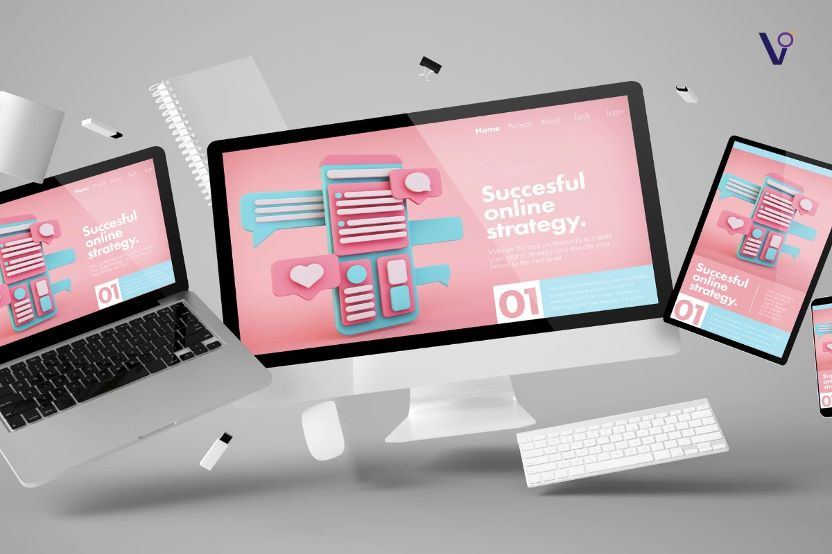
Strong typography, intentional graphics, clean layouts, emotional storytelling through visuals, and clear hierarchy. The goal isn’t just to look good — it’s to lead, evoke, and convert.
Cluttered pages, random stock images, icons added for decoration, and visuals chosen by personal taste, not strategy. Bad designs lack intentionality and emotional connection — leaving visitors disengaged.
Websites using Swiss graphic design nail it — clean grids, bold typography, minimal visuals, and intentional layouts that guide attention, evoke emotion, and deliver clear, functional communication.